
The following essay is excerpted from Because Horror (Dirty Looks and Semiotext(e)). Edited by Johnny Ray Huston and Bradford Nordeeen, with Afterward and artwork by Hedi El Kholti, Because Horror is a collection of 13 essays (including one poem) that mixes critical writing and memoir to explore horror movies and how they haunt memory.
Poster Child by Bradford Nordeen
Campfire stories work because they’re just the seeds of a story that listeners can gnaw on to grow into their own private horrors. I was raised in the Midwest when the videocassette was still relatively new. There are a million eulogies for the death of the videomart, but did you know that at their peak they even sprung up in grocery stores? It proved an excellent form of childcare. Our local Schnucks carved out a large section in the front of the store where I would get lost in the stacks, while mom glided her cart along the aisles. I guess my campfire stories weren’t stories at all but images, the posters tacked above those grey particleboard display shelves. On our weekly trips I would make my way through that maze of plastic slipcases, picking out the perfect stack. On a good day there were specials and you could get two-for-one on tapes with the pink 99 cent sticker, so a tower would slowly build until it cleared my head.
Grocery store video shops were not a vestige for the cinephile. They were suburban enclaves that you could dip into to pick up Batman and bleach. Their tapes were popular, flashy or cheap. Depth snuck in sometimes, under the pretense of salacious packaging or by way of an inspired employee, but this isn’t a story about depth. This is about the posters that lined the walls: mostly kids movies and horror films.
On the surface, posters are a straight-up marketing object. A glossy promotional item sent out by the studios to lure you into selecting their version of the current shelf-filling trend. But when you’re a kid, you’re furiously processing everything that hits your eyeballs and taking it at face value. I would move my fingers over scratches in the clear plastic cases, gazing up at the imagery, feeling through the trenches of this war between graphic fantasy and industrial consumerism. These walls were Lascaux art paintings for me, telling of the perils and thrills that lay in waiting for my eventual adulthood. Okay, that’s a hokey analogy, but in the kitten curiosity of pre-pubescence, the posters became imaginative portals. This was, after all, a land before online time.
I remember two kinds of posters that left an impression. There were the fuzzy ones, filled with warmth, golden hues and primary colors for movies like The Bear, The Land Before Time, An American Tail. They were designed to occasion wonder, awe and comfort. They were composed to be instantly recognizable (branded, we now call it). They stretched from the ceiling to ensure that greasy hands would thrust upwards, towards their respective clamshell cases. So that parents would spend their money on the adventures of talking dinosaurs, cute bears or immigrant mice. The cases for the kid’s tapes were bigger and white, but sometimes gold or yellow, I guess to make them feel more like toys. Or to protect the tapes inside from a child’s vehemence.

What really stuck with me, however, were the horror movie posters. Child’s Play 2: the killer doll Chucky leers out from the shadows, spreading wide a pair of glinting scissors to behead a grimacing jack-in-the-box. Wes Craven’s Shocker features a death-row inmate strapped into an electric chair in an orange jumpsuit. His teeth are gritted in a menacing stare out of the frame, the moment voltage envelops his body. A white baby carriage faces the ocean on a tropical beach in the poster for It’s Alive III: Island of the Alive. A black-and-yellow warning sign reads “Jarvis Baby on Board” and a claw emerges from the bassinet. A ghoulish figure peers out from the shreds made by his gnarled claws, and flickers of fluorescent purple and green light caress the shiny black fabric of John Carpenter’s Body Bags. Or an actual green ghoul pops up from the toilet bowl, wearing red suspenders like a demented Denis the Menace–Ghoulies: They’ll Get You in the End. These images were made to sell you on and approximate 90 minutes of movie. Their content was “Restricted”.
I was too young to take home the titles they hocked, but the creatures stalked from the other side of the store, laying siege on my subconscious. Often, the posters were produced by advertising agencies, the labor of photographers who had never set foot on the sets of these film studios. Their images, ultimately quite divergent from the way the movie actually looked. Later, I would find out that they were often even more arresting than the movie they sold. Back then, they became my illicit friends peering out from the frame. I did take them home, in my own way.
By the ‘90s this shifted slightly. The booming industry meant that titles could be made explicitly for this home video market, bypassing cinemas altogether. Alluring packaging might inspire the rental of a popular knockoff, the muddy tape resolution might cover up sliced budgets, bad acting and cheap effects. Carnosaur was a favorite. The poster depicted a nasty green dinosaur, backlit with its jaws stretched open, lashing a blood-red tongue. The tape hit shelves weeks before Steven Spielberg’s Jurassic Park filled multiplexes. Teenage Bonnie and Klepto Clyde finds our home video namesake in a white convertible as it barrels down some desert stretch of highway. Bonnie preens at us, shooting a toothy smile over her shoulder—she’s wearing a black cowboy hat, white Daisy Dukes, a red crop top with a semi-automatic pointed towards the pale blue sky.
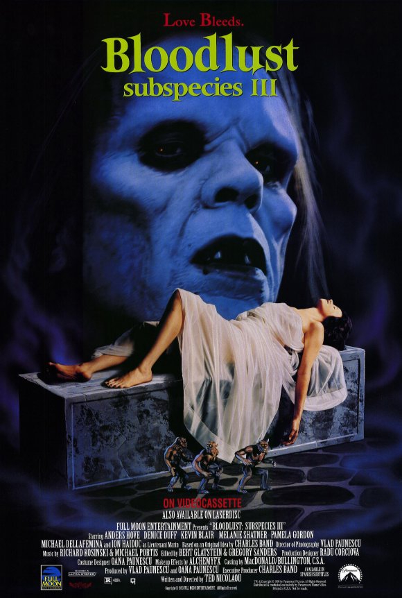
LOVE BLEEDS. A supine damsel languishes atop a cement coffin, her body barely covered by a white, ceremonial dress. Three small golems stand guard above the words ON VIDEOCASSETTE while the architectural cheekbones of a vampire fill the top half of the frame. His eyes are sunken, the moon is blue. His mouth agape, exposing two slight fangs. His long hair spills towards our painted heroine. It was this bodice-ripping poster that made me fall in love with Charles Band’s Subspecies series. Band has produced a phonebook’s worth of straight-to-video (now VOD) franchises for his company Full Moon Features (Puppet Master, Trancers, Demonic Toys, The Gingerdead Man), but it was the gothic eroticism of Subspecies that hooked me. And I did eventually take one home on videocassette, not the first one, so the story just lurched onward, which was probably for the best. In marketing there is not beginning or end.
The scariest stories are the ones you color in yourself. My little wallpaper demons were mostly an advertising ploy, aware that the power of an image could be more expansive than the mass of narrative. The gothic romance that beguiled me in the poster for Bloodlust: Subspecies III doesn’t really pan out in the video. Subspecies is a gratuitous mélange of vampire clichés shot in a castle in Romania. Even the names of their stars Anders Hove and Denise Duff tell you all you need to know. And yet I love them to this day. I love them as beacons at the intersection of imagination and means, consumerism and fantasy. I could watch all those ‘80s horror videos now, I’ve lived with their images long enough. But I know that I don’t need to. The way I hold them now is so much scarier.